The coolest, most underrated design pattern in React

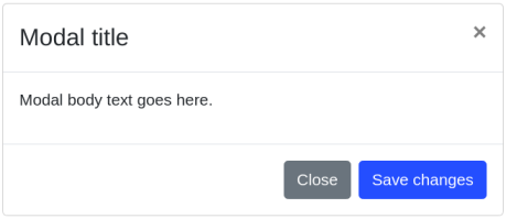
There will be times when we would like to pass props and control the behavior of child elements. Let me explain. Let’s take the following modal for example:

As you can see, the modal contains the following elements:
-
A title.
-
An
xbutton. -
Some text content.
-
A dismiss button (“Close”).
-
An action button (“Save changes”).
These elements should be modifiable if we would like the modal to be properly re-usable. That means that the user would have control over things like the displayed content, dispatched events, style, etc, of each and every element. A naive solution would be accepting distinct props for each element like so:
<Modal
  showCloseButton
  showDismissButton
  showActionButton
  title="Modal title"
  contents="Modal body text goes here."
  dismissButtonText="Close"
  actionButtonText="Save changes"
  handleDismiss={close}
  handleAction={save}
/>
The problem with that approach is that it spams the props mechanism; it makes the component look inflated and less readable. Moreover, it limits the amount of props that can be passed to child elements, and prevents the user from having a full control over them. You can solve this problem however, by providing a series or generic props objects, where each one represents a different element respectively:
<Modal
  showCloseButton
  title="Modal title"
  contents="Modal body text goes here."
  dismissButtonProps={{
    text: 'Close',
    handler: close
  }}
  actionButtonProps={{
    text: 'Save changes',
    handler: save
  }}
/>
This solution works, but then again, it doesn’t solve the spamming issue, plus, we completely abuse
the syntactic sugar that JSX provides us with. Instead of using HTML style attribute assignments
(attr="value"), we’re obligated to use JSONs.
Bootstrap for the Rescue
In Bootstrap they took a very clever approach. Instead of defining props all over the place, they gave us the ability to directly manipulate the modal’s children. Using dedicated components, we can achieve the intended functionality that Bootstrap was aiming for:
<Modal.Dialog>
  <Modal.Header closeButton>
    <Modal.Title>Modal title</Modal.Title>
  </Modal.Header>

  <Modal.Body>
    <p>Modal body text goes here.</p>
  </Modal.Body>

  <Modal.Footer>
    <Button variant="secondary" onClick={close}>
      Close
    </Button>
    <Button variant="primary" onClick={save}>
      Save changes
    </Button>
  </Modal.Footer>
</Modal.Dialog>
Great! There’s definitely a progress right there. But we can even take it a step further.
“A step further? What do you mean?” — A confused React developer
Even though things are very declarative and clear with Bootstrap’s approach, we’re still obligated to compose the entire modal. This means that we cannot use the modal’s children to fill-up the missing pieces, as if part of the logic was already implemented. It’s not always that we would like to write the modal’s contents entirely from scratch, right? Sometimes we would like to use it like some sort of template. Another point to consider, is that there’s no filter or restrictions on the children’s input. Sometimes we would like the user to use only certain elements, and thus make sure that he doesn’t mess things up. If so, what’s the right approach that goes along with it?
Introducing the Design Pattern That Has It All
Let’s recap. Based on what we gathered so far, the new design pattern should have the following characteristics:
-
No spamming of the props mechanism.
-
Has full control over child elements using
props.children. -
Has a template already in place.
-
Has restrictions on the input.
Now that sounds promising. Let’s have a look at an example. We will use the Bootstrap Modal
component as an anchor:
const ModalFromTheFuture = ({ showCloseButton, children }) => {
  const childProps = useChildProps(props.children, [
    'title',
    'contents',
    'dismissButton',
    'actionButton'
  ])

  return (
    <Modal.Dialog>
      <Modal.Header closeButton={showCloseButton}>
        {childProps.title && <Modal.Title {...childProps.title} />}
      </Modal.Header>

      <Modal.Body>{childProps.contents && <p {...childProps.contents} />}</Modal.Body>

      <Modal.Footer>
        {childProps.actionButton && <Button {...childProps.actionButton} variant="secondary" />}
        {childProps.dismissButton && <Button {...childProps.dismissButton} variant="primary" />}
      </Modal.Footer>
    </Modal.Dialog>
  )
}
As you can see, the new modal component uses a hook called useChildProps(). This hook will go
through `props.children` and will basically flatten nested props. In addition, it will validate
them against a provided white list, to make sure that the right element names were addressed. This
is how its implementation should look like:
const useChildProps = (children, whitelist) => {
  return useMemo(() =>
    [].concat(children).reduce(
      (childProps, child) => {
        if (whitelist && !whitelist.includes(child.type)) {
          throw Error(`element <${child.type}> is not supported`)
        }

        childProps[child.type] = child.props

        return childProps
      },
      [children]
    )
  )
}<ModalFromTheFuture showCloseButton>
<title>Modal title</title>
<contents>Modal body text goes here.</contents>
<dismissButton onClick={close}>Close</dismissButton>
<actionButton onClick={save}>Save changes</actionButton>
</ModalFromTheFuture>“Wait a minute, can’t it cause a confusion with native HTML tag names?” — The developer from before
True, but that can also be said about any other React component. Ever since the introduction of component based UI (e.g. Angular, React, Vue or even Web components), new tag names aren’t so rare to come across by, therefore you shouldn’t be afraid to use the new design pattern.
Join our newsletter
Want to hear from us when there's something new? Sign up and stay up to date!
By subscribing, you agree with Beehiiv’s Terms of Service and Privacy Policy.
Recent issues of our newsletterSimilar articles

Nextra 3 – Your Favourite MDX Framework, Now on 🧪 Steroids
MDX 3, new i18n, new _meta files with JSX support, more powerful TOC, remote MDX, better bundle size, MathJax, new code block styles, shikiji, ESM-only and more

Nextra 2 – Next.js Static Site Generator
Here are what the new version of Nextra 2 Framework includes.

Unleash the power of Fragments with GraphQL Codegen
The most important parts of Relay are the concepts of building and scaling applications, let's show how you can use these patterns in your existing projects.

GraphQL with TypeScript done right
How to get the most of React application types with GraphQL Code Generator.